Introducing: Anomalo Pulse
March 2, 2022
When asked about an organization’s data quality, most responses invoke a feeling. Do I feel confident in my data? Am I nervous when presenting a deck to upper management? Am I sure we’re charging customers the correct price? Can I say without a doubt that this A/B test was a success?
If enough people across the organization answer “No” to these questions, a data executive will prioritize improving data quality. Such initiatives could take quarters, even years, to complete and usually end in less than satisfying results. Why?
We’ve all heard Peter Drucker’s famed quote:
“If you want to improve something, you better start by measuring that thing.”
However, few organizations have the tools to measure improvements in data quality. As such, data quality initiatives can feel like Sisyphean efforts. Moreover, it’s never clear how good is good enough. No data is perfect. Data changes over time and is inherently chaotic. Thus striving for a state of data nirvana is both intractable and impractical. Having data quality KPIs and setting goals against them is essential to solving the problem.
But where should you start? What KPIs should you be monitoring, what is the current state of data quality, and what is a realistic goal? The Anomalo Pulse Dashboard is built to address precisely these questions. It provides a comprehensive view of data quality in your organization and aggregates all your data quality vitals in one place.
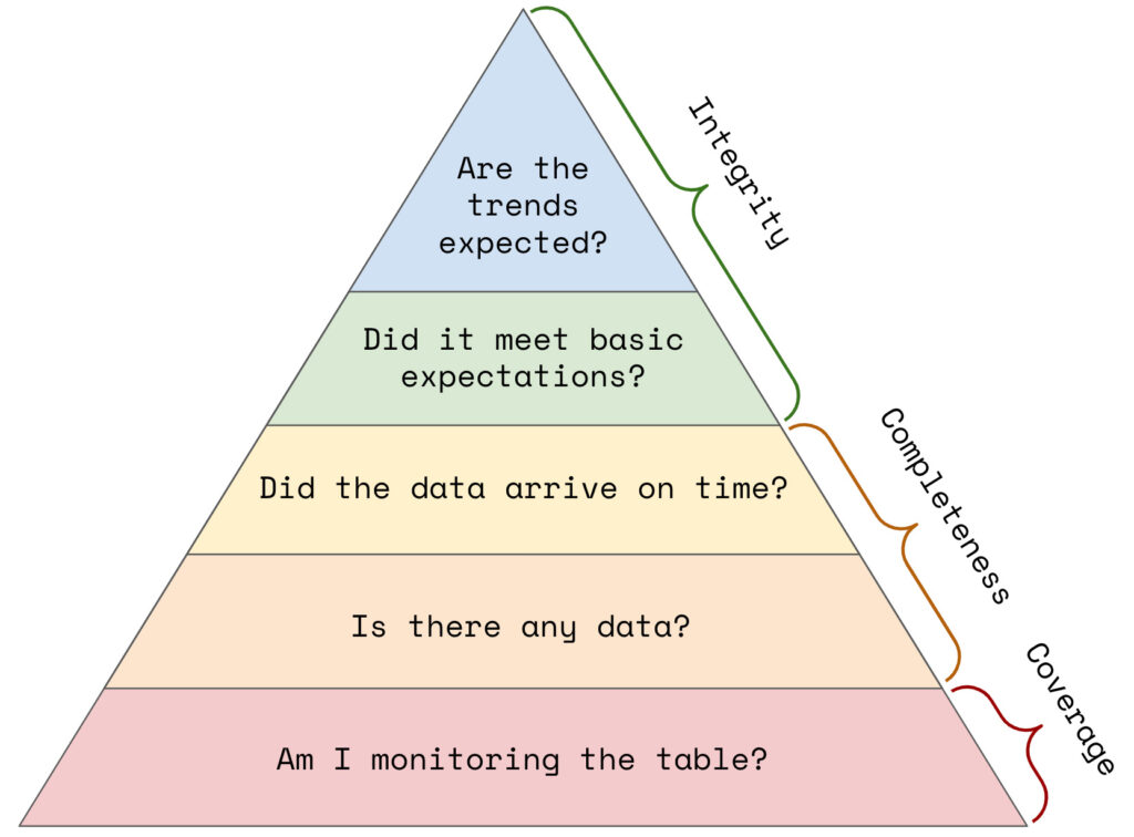
To build it, we defined a hierarchy of data quality needs, ensuring that we monitor metrics within each of the three pillars: data coverage, data completeness, and data integrity.

We used this hierarchy as a guide and designed Pulse to address all aspects of a healthy data quality environment. We believe a healthy data quality environment is one in which:
- More tables are being monitored
- New data is consistently arriving in tables on time
- A high percentage of tables are always passing all data quality checks
- There is a high level of coverage of custom metrics and validation rules
- Data quality checks are passing frequently
Pulse only launched recently but is already making a big impact across our customer base. But don’t take it from us, here’s what one of our biggest customers has to say:
“This feature has been incredibly helpful for our team! Before the pulse dashboard, it was a laborious and time intensive task to monitor the health of our tables and checks. This made it difficult to identify where clean-up opportunities might be. Since it launched, our teams have been able to clean things up swiftly, and quickly grasp the scope of data issues that surface.”
— Gilad Lotan (VP Head of Data Science and Analytics at Buzzfeed)
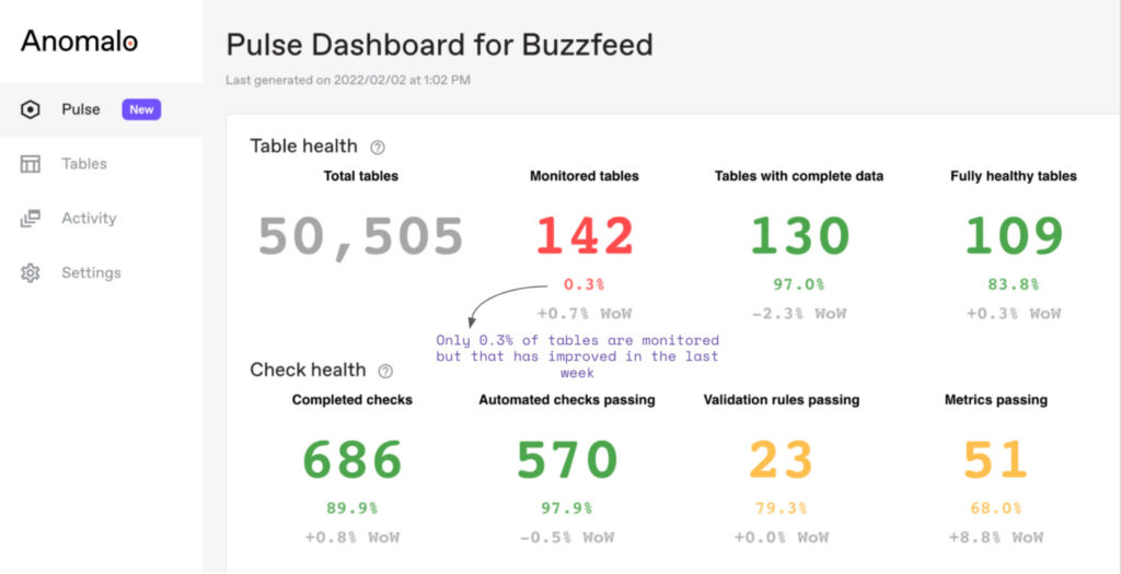
In the screenshot below, you can see the health statistics for Buzzfeed’s Pulse dashboard.

Looking at the dashboard, an executive can easily answer the majority of questions they may have. Let’s answer a couple of them for Buzzfeed:
What KPIs should we be monitoring?
The dashboard shows the 8 most important KPIs we’ve found to drive data quality. They span each of the pillars, including coverage (monitored tables, number of checks), data completeness (tables with complete data), and data integrity (fully healthy tables, validation rules, and metrics passing).
What is the current state of data quality?
Quite good actually, but that might be biased by the fact that only 0.3% of tables are monitored. There are two great next steps here. First, the team could focus on increasing coverage for all their most important tables. In parallel, they can also drop or exclude some of the 50,505 tables in their organization so that they could focus on the ones that are most important.
How is that trending over time?
It looks like the vast majority of our table’s data arrives on time though there has been a slight decrease as compared to last week. There also appears to be an 8.8% jump in the passing metric checks

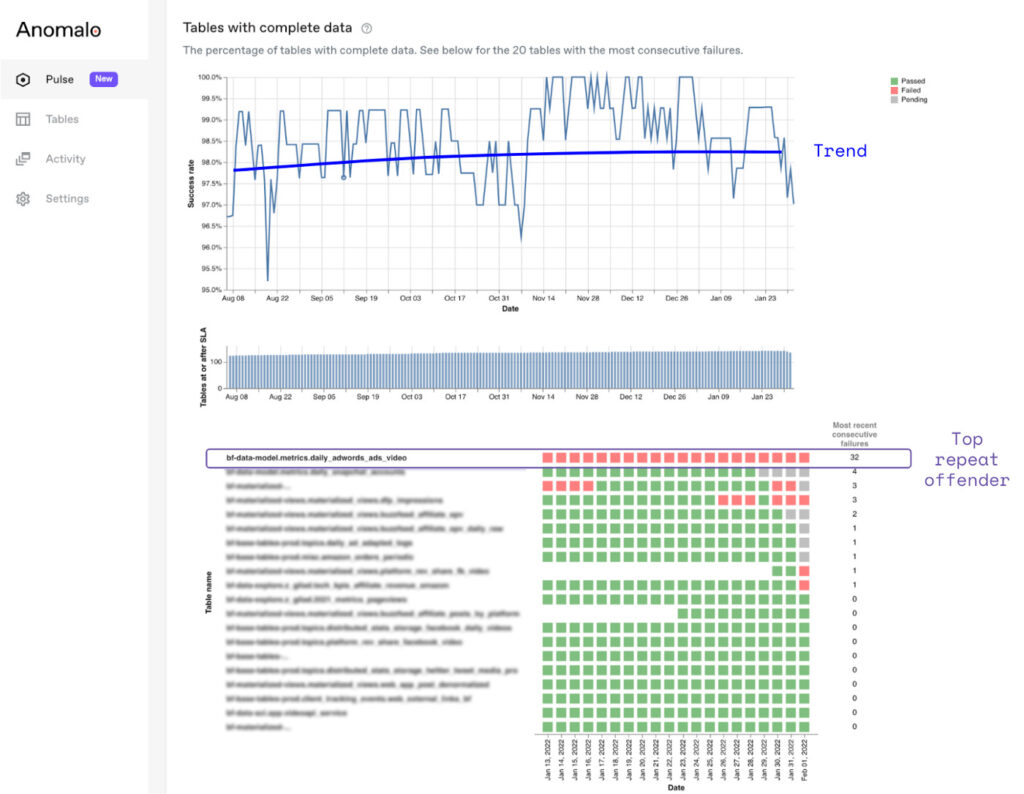
These are a great start to getting a lay of the land, but Pulse also provides a deep dive into each of these statistics making it clear exactly what next steps you should prioritize. For example, let’s take a look at data arrival times and which are the most problematic tables that consistently miss their SLA.

In the time series visualization, you can see that on most days, over 90% of tables update on time. In the matrix below, tables are ranked by the most consecutive failures so you can see a prioritized list of the biggest repeat offenders. It looks like the table metrics.daily_adwords_ads_video has not been updated for 32 days.

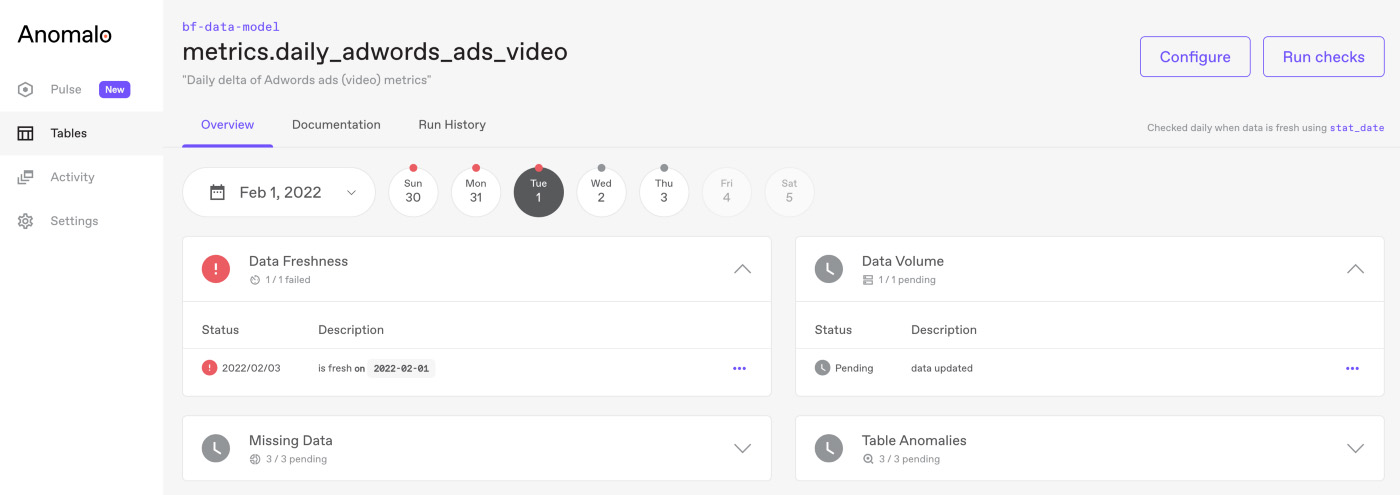
By clicking on any of its squares, you can see the table’s status for that day and that, in fact, no fresh data has arrived. As such, it is probably a good idea to do a backfill, fix any pipeline issues or drop it entirely. Your team can continue iterating on this process until a sea of green replaces the red and gray squares.
Similarly, you can identify and resolve which tables have the best coverage and which teams might need to monitor more tables. Remember that these pillars cover the first part of data quality monitoring: identifying an issue. The path to great data quality is naturally followed by root-causing the issues and finally resolving them.
Anomalo’s Pulse dashboard provides data owners with a high-level picture of data quality performance over time and allows them to understand the state of:
- Data quality coverage — evaluate coverage, define the gold standard and pinpoint blind spots
- Data arrival times — identify tables whose data doesn’t arrive on time or meet SLAs
- Data quality trends — a snapshot statistic is not enough to track data quality, track improvements over time with time-series views and week over week changes
- Repeat offenders — use the ranked list of repeat offenders to prioritize and define your next data quality action items
See how Pulse can help you achieve your data quality goals — request a demo today.
Categories
- Product Updates
Get Started
Meet with our expert team and learn how Anomalo can help you achieve high data quality with less effort.


